Suyash Agarwal
Neural methods for neural data
Adventures in detecting neural oscillations
I thought I’d write a blog about some signal processing realisations I had recently. This may or may not end up being interesting. Read on to find out I suppose.
Background
Neural oscillations are periodic patterns of electrical activity in the brain. Neuroscientists believe they are responsible for or contribute to a range of cognitive processes. I was trying to detect these neural oscillations in data recorded via high-density electrophysiology probes. This data, which consists of a list of time points at which spikes (action potentials) occurred and a correspoding list that tells you which neuron was responsible, has high temporal and spatial resolution and recent hardware advances have meant that we can record far greater numbers of neurons than before. My goal with detecting neural oscillations was to then measure how coupled each neuron was to the up and down phases of oscillations.
Frequency domain exploration
I was told to look for oscillations in the frequency range 1-10 Hz. Easy, I thought, I’ll just use Alfred to whip up a quick spectral analysis and I’ll see a nice peak in that frequency range. Then I can pick out wherever the frequency peaks are especially prominent and designate those time periods as oscillatory. Periods with a more uniform frequency spectrum are probably not oscillatory. I’m generally a big fan of anything that makes me feel like an engineer and doing Fourier transforms is high up on that list. So on I cracked, and Alfred gave me this:
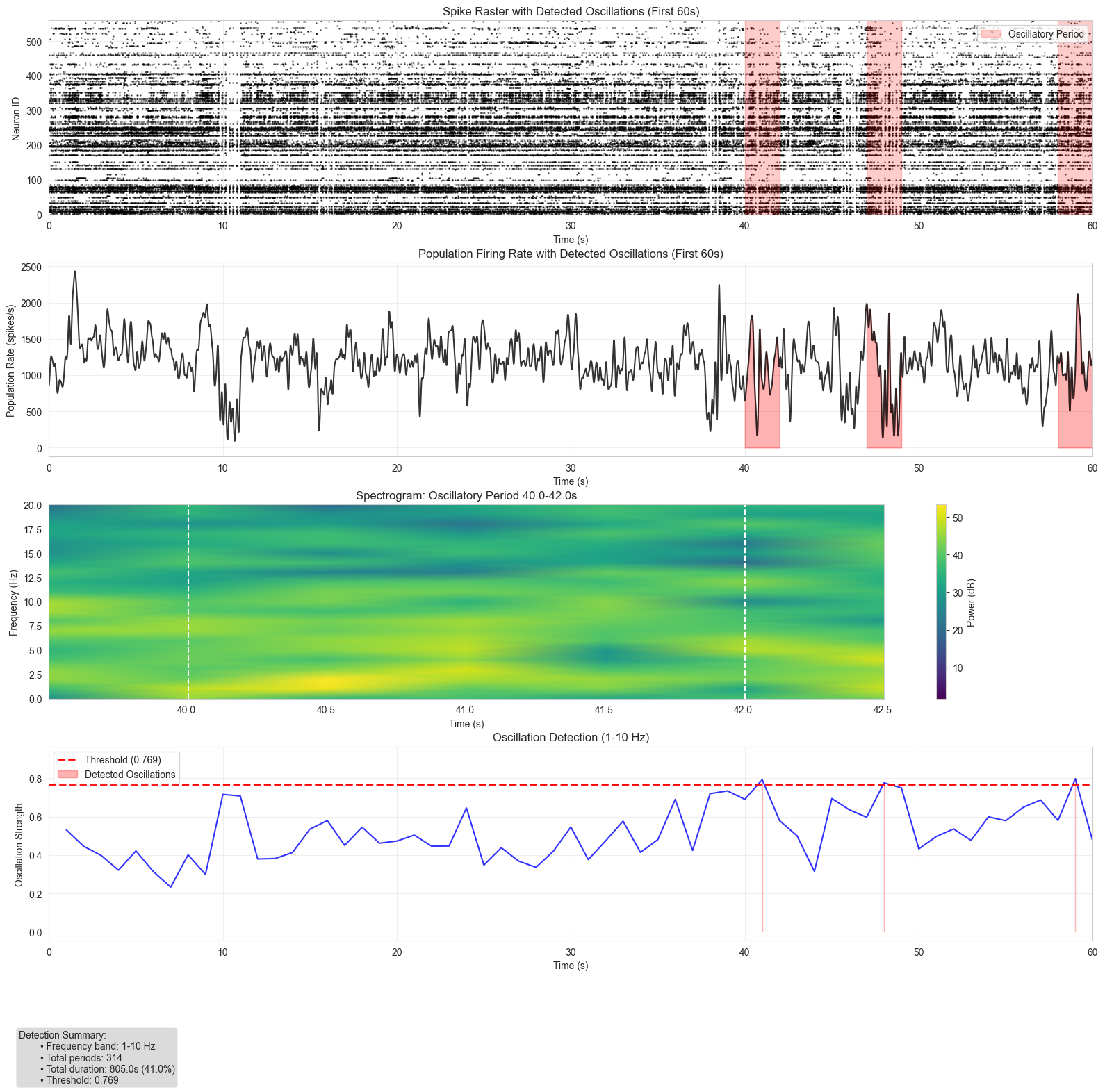
Side note - it really is as easy as I make out to do analysis like this with Alfred. Try it out. At the top of the plot, we see the first 60s of the recording with the detected oscillatory periods highlighted. Directly below this is the population firing rate (summed activity in 10ms bins) for the same time period, again with the oscillatory periods highlighted. Below that is the spectrogram in a selected oscillatory period. This shows the frequency content in that time window, and as I hoped, there is definitely a peak at around 1-3 Hz. Given the power spectrum, we normalise power in the 1-10Hz range by the total power to define oscillation strength (biased towards our frequency range of interest). This is shown at the bottom, where we take the top quartile of bins by oscillation strength to define the red areas.
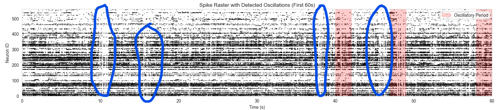
Does this work? Kind of. By eye you can see that there are areas in the raster plot (top one) that look oscillatory but are not highlighted. I’ve circled a couple of these below:
So what’s going wrong? Is the trusty Fourier transform not the right tool for this job?
Limitations of the Fourier transform
First, let’s get more precise. What I (or Alfred) did earlier was a windowed Fourier transform. This involves windowing the function into smaller chunks of time and computing the Fourier transform on each chunk to get some idea of how the frequency content changes over time. This is important - without it, the Fourier transform would just give the frequency content present in the whole signal with no indication of when different frequencies occurred.
This sounds great, but comes with some caveats:
- It’s good practice to detrend the signal in each window before applying the FT. This removes any unwanted low-frequency components that would skew the results.
- It’s crucial to pick a windowing function to convolve with each chunk. This is a function that goes to 0 at either end, e.g. a Gaussian window. When you convolve your chunk with the windowing function, the chunk also goes to 0 at either end, ensuring that there are no discontinuities at the edges, which would cause spectral leakage and introduce artifacts in the frequency estimation. I used a Hann window.
- You have a certain resolution in both time and frequency domains. This is set by the window size you choose. In my case, I used 2s windows with a 0.5s overlap. If I had used a shorter window, the result would be more localised in time but I wouldn’t be able to detect any oscillations with period greater than the window length. Conversely, longer windows give better frequency resolution but worse time resolution. The relationship between these uncertainties is described by the Heisenberg-Gabor limit: $ \sigma_t \sigma_f \ge 1/4\pi$. Having longer windows, we also come up against the implicit assumption of stationarity in each window. If the frequency content changes within a window, we won’t know when that happened.
- I actually use scipy’s implementation of Welch’s method for spectral density estimation. Compared to a simple short-time Fourier transform, this gives you less noise in exchange for slightly worse frequency resoluton. Since I only really care about frequencies in the broad range 1-10 Hz, this was a fine trade-off to make. When we interpret the PSD, we make the implicit assumption that the signal is a linear superposition of independent oscillators (i.e. total power is the sum of power in different frequency ranges). I lean into this even more when I normalise the power in the range of interest by total power to get oscillation strength. If there are different frequency components that interact with each other, this isn’t really valid.
- Finally, we only used the magnitude of the frequency spectrum to do this oscillatory period detection. This completely ignores all the phase information. To see why this is important, see a picture from my undergrad lectures on image processing:
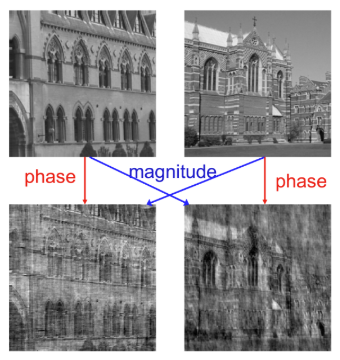
At the top are two different images, and they swap the magnitudes and phases of their respective 2D Fourier transforms. The bottom images look much more similar to the whichever image they inherited the phase from, indicating that phase actually contains more useful information about the original signal than the magnitude.
Phase randomisation experiment
We can do a similar thing with our neural data. Here’s the population firing rate of the original data over the first 10 seconds, along with the population rate of some data with phase drawn from a uniform distribution. Detail: when you do this, it’s important to maintain the Hermitian symmetry of the Fourier representation of the signal, otherwise when we apply the inverse Fourier transform to reconstruct the time-domain signal, it won’t be real-valued.
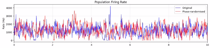
They look pretty different to each other. We certainly wouldn’t expect the oscillations to occur at the same times, and they don’t. But these two recordings are treated equally by the spectral method.
Wavelet transforms
Now we can get into some serious time-frequency analysis. Wavelet transforms get around the Heisenberg-Gabor limit on time and frequency-domain resolutions by giving you the best of both worlds. As before, we slide a function over the signal, but now we do this lots of times, and change the properties of the wavelet function each time. This gives us the same information at a range of different time (and therefore frequency) resolutions, and we can build this up into a high-resolution time-frequency representation of the signal. There are a whole bunch of wavelet functions you can use, and they have to satisfy certain mathematical properties. In order to keep the maths content light, I’ll defer to Wikipedia for more in-depth explanations of why wavelet transforms work. For now, it suffices to say that I used a Complex Morlet wavelet function and once again followed the same strategy of normalising power in the 1-10 Hz range to get a measure of oscillation strength and then thresholding this.
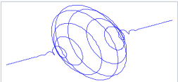
This is the complex Morlet wavelet. And here are the results:
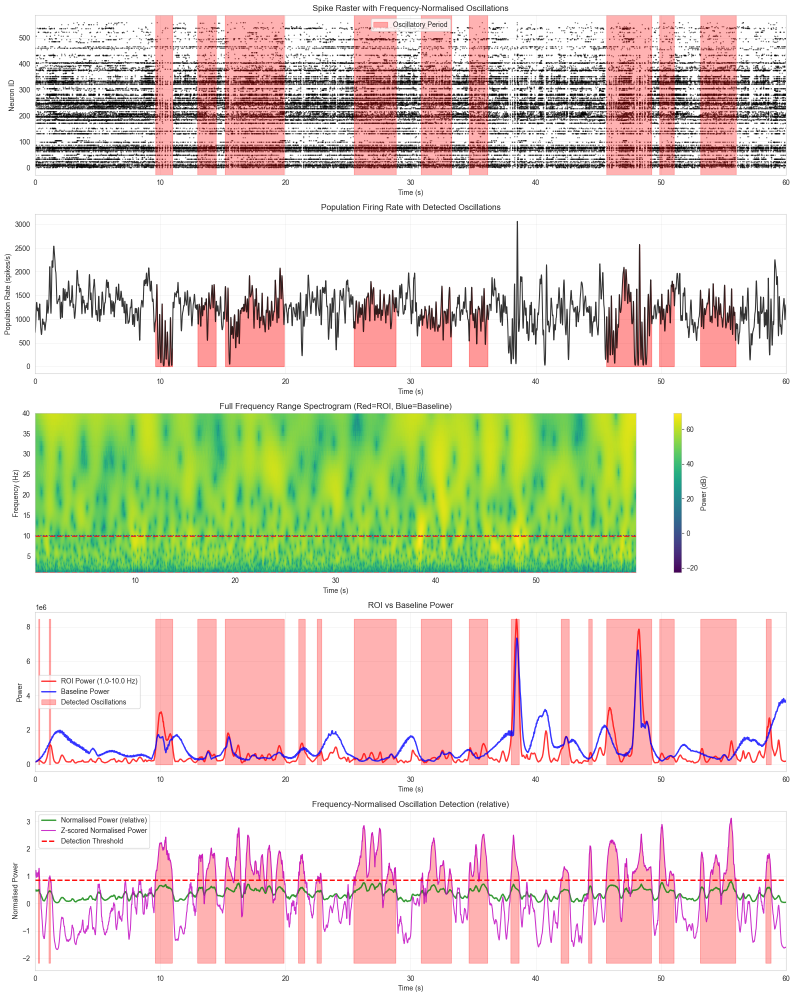
Once again, the top plot is the raster with the oscillatory periods highlighted. Below this is the population firing rate. Below that is the frequency spectrum, also over the first 60s. Below that is where is gets interesting. You can see the wavelet frequency power in the 1-10 Hz range in red and the baseline power that we compare to in blue. I then z-score the red using the blue to get the normalised power (green line in the bottom plot) and the z-score the normalised power relative to itself to get the pink line. This is what I threshold to detect oscillatory periods. And as for the results? Definitely better than the Fourier transform. For instance, the very obvious oscillations around the 10s mark are now being detected. But we still miss some, like around the 38s mark. Looking at the lower plots, we can see that this is because the baseline power and 1-10 Hz power both peak at this point, and while the difference between them is enough to pass the detection threshold, this oscillation doesn’t last long enough to make the final grade.
A different approach
My next instinct was to try something like a Hilbert transform to detect instantaneous phase of the analytic signal, so I did and found that I was still struggling to get the results I was looking for. I was trying to use tools that I thought should work and tell me something this data, but when I evaluated them by eye they were all missing a bunch of down phases. This is where fitting your approach to the task at hand really matters. My goal was to be able to detect up and down phases so that I could test how coupled neurons were to these phases, i.e. does a neuron fire more in up phases than down phases and if so then how much more. A strongly coupled neuron would heavily modulate its firing in line with these phases. Therefore, when evaluating by eye I was only really looking at whether or not a method was picking out clear down phases as being oscillatory, as this is what I needed to answer the question I was asking.
This is not what Fourier transforms, wavelet transforms or Hilbert transforms are really designed to do. These are all great techniques for doing time-frequency analysis and crucially, they all make me feel very much like an engineer. But none of them is designed to just tell you when the population is firing less than usual (indicating we’re in a down phase). So I went back to basics and looked at the distribution of spike counts in each 10ms bin to see if there was an obvious way to threshold this and pick out down phases that way.
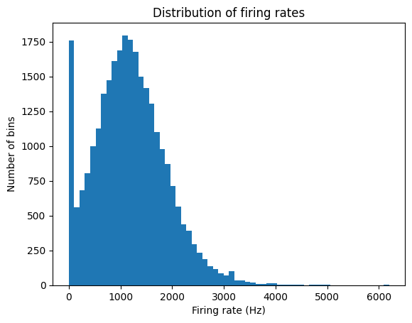
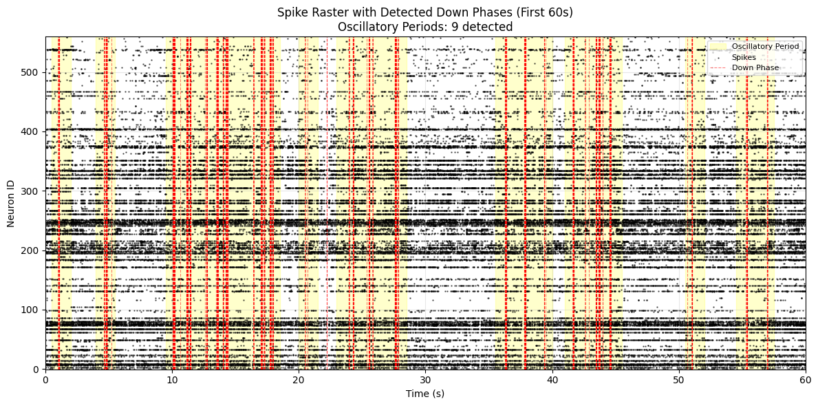
And there is! It looks like firing rate is roughly normally distributed with a big extra peak at 0. These extra bins are likely the down phases we’ve been looking for. So here’s a raster plot with the newly discovered down phases highlighted. I also set 1 second windows with a a certain number of down phases to be oscillatory and highlighted these. You can see that the results now look a lot better.
To be continued..